Frontend
Table of Contents
Frontend
Recommended Extensions
VSCode
- Prettier
- Live Server
- Auto Rename Tag
- Color Highlight
HTML
Theory
- HTML markup goal is to provide semantic information about content (not presentational).
It should be used to define structure of document and leave appearance for CSS.- Pseudo-obsolete elements as
<b>and<i>are examples of this case.- They started as bold and italics, but in HTML5 to create separation between structure and presentation
<strong>and<em>was introduced.
- They started as bold and italics, but in HTML5 to create separation between structure and presentation
<div>Elements don’t change Semantic structure - they are helpful in organizing Presentational structure
- Pseudo-obsolete elements as
- HTML merges all whitespaces into a single space.
- Also don’t abuse
<br/>tag.- Remember - HTML is for semantic information, not for positioning elements. Don’t use it for adding multiple empty lines between paragraphs.
- Similar case is for
<hr/>- don’t use it for displaying line.<hr/>element - think of it as something of importance between new paragraph and new heading.- For displaying a line use CSS border property instead.
- Also don’t abuse
- Attributes
- In
<a href="...">...</a>hrefis an Attribute
- Attributes provide additional information about elements
- Attributes are always specified in the start tag
- Attributes usually come in name/value pairs like: name=”value”
- In
- Block vs Inline
- Block-level Element (flow content)
- Block Element appears below previous Block Element.
- Width is set automatically based on width of Parent Container
- Height is by default height of child Block Boxes it contains
- Inline Element (phrasing content)
- Inline Elements can affect sections of text anywhere within a line
- Inline Elements don’t affect vertical spacing
- Top and Bottom Margins are ignored
- If you add some enormous Padding, it will overlap other Elements, but it won’t affect vertical spacing
- You need to use Block Elements to modify vertical spacing
- Width is based on content it contains
(not Width of Parent Element)
- Block-level Element (flow content)
- Links
- Absolute Links
- Example
https://developer.mozilla.org/en-us/docs/web/html
- Build
- Scheme
https://
- Domain
developer.mozilla.org
- Path
/en-us/docs/web/html
- Scheme
- Example
- Relative links
- Relative links point relatively as you were in terminal.
Scheme and domain name are implied to be the same as the current page, so you only supply the path.misc/extras.html../images.html
- Relative links point relatively as you were in terminal.
- Root-Relative Links
/index.html
- Absolute Links
- Don’t use spaces in URLs
- They require special handling, they should be avoided at all costs.
- Instead of space use hyphen
- Also it’s good idea to use all lowercase characters for consistency
- Images
- Image content is defined outside of the web page that renders it
(unlike all the HTML elements we’ve encountered so far) - It is better to handle image size in CSS instead of using attributes
widthandheight(to be able to alter them using media queries) - Adding
altattribute to images is best practice.- This has impact on search engines and users with text-only browsers
- Image content is defined outside of the web page that renders it
- Image types
- JPEG
- Used to handle large color palettes without significant increase in file size.
- Use for photos and images with gradients
- GIF
- Limited in color palette
- Transparent pixels are binary - no semi-opaque pixels
- PNG
- Use for anything that is not photo nor animation
- No color palette limitations
- Use for things like icons, tech diagrams, logos, etc.
- SVG
- Vector-based graphics - can be scaled infinitely without quality loss
- Therefore great tool for responsive design
- If possible, use it everywhere where you would use PNG
- Text in image can increase file size
- JPEG
- Another important HTML Attributes
- Document language
<html lang='en'>
- Encoding
<meta charset='UTF-8'>
- Document language
- HTML Entity
- HTML Entity is a special character that can’t be represented as plain text in HTML Document.
- Starts with ampersand
&and ends with semicolon;. - Before UTF-8 HTML Entities were more useful because HTML wasn’t allowed to have special characters Therefore nowadays HTML Entities are used mainly for Reserved Characters.
- Reserved Characters
- Reserved Characters are:
<,>,& - For using Reserved Characters you have to use HTML Entities
< > &
- Quotes are another example of HTML Entities
"" ''->“ ” ‘ ’
- HTML Entities list can be found at: https://html.spec.whatwg.org/multipage/named-characters.html
- Reserved Characters are:
- Empty Element
- Empty Element is element which doesn’t have closing tag,
- e.g.
<link />or<br />
- e.g.
- Empty Element is element which doesn’t have closing tag,
Relevant tags
<header>- Introductory content, typically a group of introductory or navigational aids. It may contain some heading elements or others like a logo, a search form, an author name.
<main>- Dominant content of the
<body>of a document. The main content area consists of content that is directly related to (or expands upon) the central topic of a document (or the central functionality of an application).<aside>
- Portion of a document whose content is only indirectly related to the document’s main content. Asides are frequently presented as sidebars or call-out boxes. 2.
<section> - Generic standalone section of a document, which doesn’t have a more specific semantic element to represent it. Sections should always have a heading, with very few exceptions.
- Dominant content of the
<a>target="_blank"- Opens the linked document in a new window or tab
CSS
- CSS rules
- Selector
- e.g.
p
- e.g.
- Declarations,
- e.g.
color: #FF0000;, - where in this example:
- Property is
color - Value is
#FF0000
- Property is
- e.g.
- Selector
- To use CSS in webpage link it with
<link>:<link rel='stylesheet' href='styles.css'/>- Other options to be used with
<link>:
https://developer.mozilla.org/en-US/docs/Web/HTML/Attributes/rel
- Units of Measurement
- Most common:
pxem
emis used to define sizes relative to some base font, e.g.:body { font-size: 16px; }h1 { font-size: 2 em; }h2 { font-size: 1.6em; }- Here base size is
16px, andh1are 2x in size andh2are 1.6x in size - Therefore when we change base font size, these heading will scale accordingly
- Other Units of Measurement:
https://developer.mozilla.org/en-US/docs/Web/CSS/length
- Most common:
- Multiple Elements in Selector
h1 h2 h3 h4 h5 h6 { font-family: "Helvetica", "Arial", sans-serif; }- Here
font-familyvalues are more historical, as before users may not have some fonts installed, so the right-sided values are fallbacks - Currently we have Web Fonts superseding System Fonts that resolves this problem
- Here
- Cascade order
- The browser’s default stylesheet
- User-defined stylesheets
- External stylesheets
- Page-specific styles
- CSS defined in
<style>Element - In general, don’t use Page-specific styles. Use External stylesheets instead.
- CSS defined in
- Inline styles
- Override everything
- Example:
<p style='color: #990000;'> - Don’t do this..
- To apply style to only one type of Element use CSS Classes
- Overall CSS Reference
- https://developer.mozilla.org/en-US/docs/Web/CSS/Reference
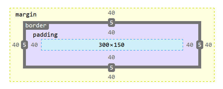
- Box Model
- Box Model is set of rules which define way how to render a web page.
Every Element is treated by CSS as a Box with particular properties determining its location on the page. - Properties
- Content
- Text, image or other content
- Padding
- Space between Content and Border
- Has Background
- Included in click area
- Doesn’t collapse vertically
- Border
- Line between Padding and Margin
- Everything inside Border have a Background
border: size style colorborder: 1px solid #5D6063;
- Margin
- Space between Box and surrounding Boxes
- Transparent - no Background
- Not included in click area
- Collapses vertically
- Content
- Box Model is set of rules which define way how to render a web page.
- Shorthands
property: vertical horizontalpadding: 20px 10px;
property: top right bottom leftpadding: 20px 0 20px 10px;
- Vertical Margin Collapse
- When two boxes with vertical Margins are next to each other - Vertical Margin Collapse will happen.
- Instead of Margins being added, they actually collapse (smaller Margin collapses into bigger Margin)
- You can then think about Vertical Margins as “minimum space” between other Elements
- Vertical Margin Collapse happens only for consecutive Elements
- You can prevent it by inserting e.g. a
<div>with non-zeroheightbetween<p>s with Vertical Margins
- You can prevent it by inserting e.g. a
- Some other workarounds may be:
- Use Padding which does not Collapse
- Use only
bottom-onlyortop-onlyMargins, so they won’t overlap
- Generally nowadays this is no longer an issue as e.g. Flexbox doesn’t have collapsing Margins
- When two boxes with vertical Margins are next to each other - Vertical Margin Collapse will happen.
- Width and Height
widthandheightdefine only content size- Padding and Border are added on top of these dimensions
- It is because by default
box-sizingis set tocontent-box - 🔨 In general, it’s a good practice, that you set
box-sizing: border box- Then the whole box will be of desired dimensions and content width will be set automatically
- Center Box with auto-margin (without Float nor Flexbox)
- Set left and right Margin of block-level Element to
autoto center it within Parent- One thing - it works only if you set Element
width- otherwise it will nevertheless take all the space of Parent making this centering operation meaningless
- One thing - it works only if you set Element
- Set left and right Margin of block-level Element to
- Resetting Styles
- Every browser can perform some styling on its own
- Therefore making web pages look consistently everywhere a hard job
- It is a good practice to add “universal” CSS Selector
*matching every HTML Element - The minimum recommended settings are
margin: 0padding: 0box-sizing: border box
- Every browser can perform some styling on its own
- Selectors
- Type Selectors
p,body,div
- Class Selectors
- Add
class='myclass'Attribute to HTML Element - Use
.in Selector- e.g.
.synopsis,.myclass
- e.g.
- You can add multiple classes to HTML Element
<div class='button cancel'>- Order of classes in CSS File - matters
- Order in HTML Attribute - doesn’t matter
class='button cancel'=class='cancel button'
- Naming convention
- Use all lowercase and hyphens for spaces
- Try not to name classes according to appearance (e.g.
.italic), use semantic names instead (like.synopsis)
- In general Class Selectors have reasonable compromise between versatility and their drawbacks, so you should mostly use them
- Add
- ID Selectors
- Use
#in Selector- e.g.
#main-button
- e.g.
- There can be only one element with a given ID on the page
- ID Selectors also are target for URL Fragments
- It’s the
#somethingat the end of URL
- It’s the
- Use
- Type Selectors
- Descendant Selectors
- Used to style Elements being inside other Element
- e.g.
.synopsis strong,h2 span - In overall don’t overuse Descendant Selectors as it may lead to Specificity Nightmare
- Child Selector
>- Matches only direct child
- e.g.
div > span - More info:
https://developer.mozilla.org/en-US/docs/Web/CSS/Child_combinator
- Pseudo-Classes
- Common Pseudo-Classes for links
:link- link not visited:visited- link visited:hover- mouse hover:active- mouse button pressed
- You can combine Pseudo-Classes
a:visited:hover- hovering on already visited link
- Pseudo-Classes for Structure
:first-of-type,:last-of-type- e.g. last paragraph would be
p:last-of-type - (!) The first/last Element is selected in every container
- If you need to select Element only in a one container, then you may need to use Child Selector
.page > p:first-of-type
- If you need to select Element only in a one container, then you may need to use Child Selector
- e.g. last paragraph would be
- More Pseudo-Classes
- https://developer.mozilla.org/en-US/docs/Web/CSS/Pseudo-classes
- Common Pseudo-Classes for links
- CSS specificity
- Defines weight for categories of Selectors
- Therefore some Selectors will override other Selectors no matter of their order in CSS file
- Specificity
!important- 10 000- Inline Style - 1 000
- ID - 100
- Class, Pseudo-Class, Attribute Selector - 10
- Element, Pseudo-Element - 1
- Defines weight for categories of Selectors
- Floats (
float)- Used to horizontally position Element
- But additionally it also makes surrounding Elements flow around
- Floated Elements don’t count into container height
- (PS: Remember that for centering Block Element you use
margin: 0 auto;)
- Clearing Floats
- Theory
- It’s a way to tell browser to account height of floated Elements into the container
- You can see if floats are calculated by setting a background color to the container
- Practice
clearclear: both- (
bothmeans:leftandright)
- (
- Makes Block Element ignore floats before it
- So it appears after (below) them
- (As by default it would be added just after preceding floated Elements)
- It works only for Elements inside a container
- Use it when you have some unfloated Element at the bottom of container
overflow- Add
overflow: hiddento container to make it account height of floated Elements - Use it mostly in all cases
(apart from having single unfloated Element at the bottom of container, when you useclear)
- Add
- Theory
- Percentage Values
- Relative to the width of the Parent Element
- Flexbox (Flexible Box)
display: flexenables Flexboxjustify-content- horizontal alignmentflex-startcenterflex-endspace-aroundspace-between
align-items- vertical alignment (cross-axis alignment)flex-startcenterflex-endstretchbaseline
flex-wrap- wrap Elementswrapnowrap
flex-directionrowcolumnflex-direction: column“swaps”justify-contentandalign-itemsdirections, so now justification happens vertically and alignment horizontally
row-reverse/column-reverse- reverses order of Elements- (But beware not to mix content with presentation)
order- Sets order of an Element
- E.g. for swapping first and last items
.first { order: 1 }.last { order: -1 }
align-self- Sets alignment for particular item (and overrides container setting)
- Available values are the same as for
align-items
flex- Used to set/distribute width of the Elements themselves
(whilejustify-contenthandles spaces between Elements) - To set weight, type a number like
flex: 1orflex: 2 flex: initial- use to set original weight
- Used to set/distribute width of the Elements themselves
- Auto margins
- Auto margin consumes all extra space in a flex container
- You can use it to spread elements
margin-left: auto- set it on right Element to move it with other right Elements to the right and all left Elements to the left
- Some Properties
white-spacehow white space inside an element is handled- e.g.
nowrap,break-spaces
- e.g.
overflow- when content can’t fit in Element’s padding box (overflows) in the horizontal and/or vertical direction- e.g.
hidden,scroll
- e.g.
Model
On the left side there’s a definition and on the right side an example of it:
Value: 20px
Property: font-size
Declaration (Style): font-size: 20px
Declaration block:
1
2
3
4
5
 {
  color: blue;
  text-align: center;
  font-size: 20px;
}
Selector: h1
CSS Rule:
1
2
3
4
5
h1 {
  color: blue;
  text-align: center;
  font-size: 20px;
}
Box model
Box model consists of 4 elements.
- content
- padding
- border
- margin
Sources
Interneting Is Hard
Friendly web development tutorials for complete beginners https://internetingishard.netlify.app/